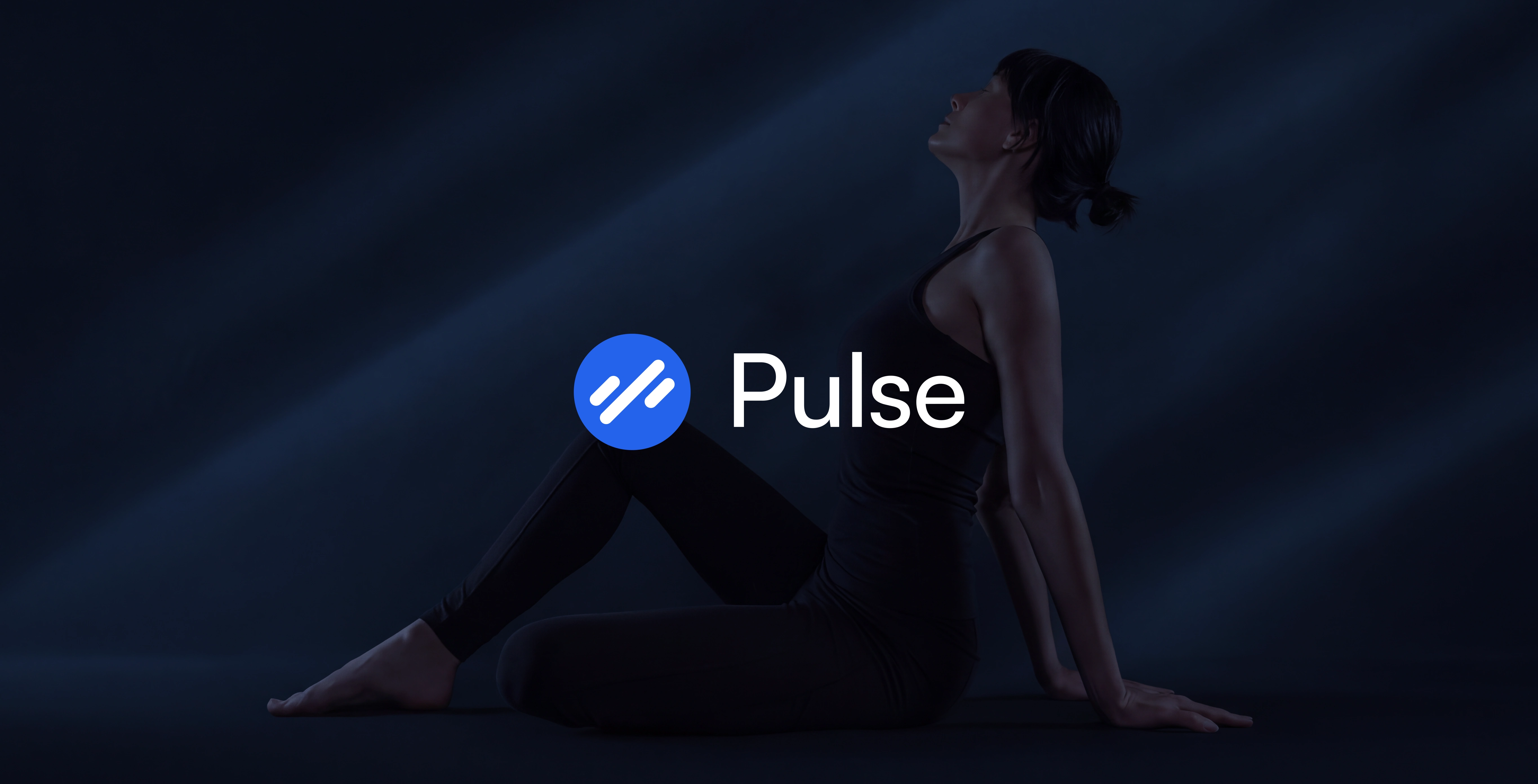
Pulse is a fitness technology brand identity concept built on a simple idea: progress includes recovery. The identity pairs electric blue and expressive diagonal graphics with clear, focused interfaces, connecting movement, planning, and reset across the app, wearables, and physical applications.
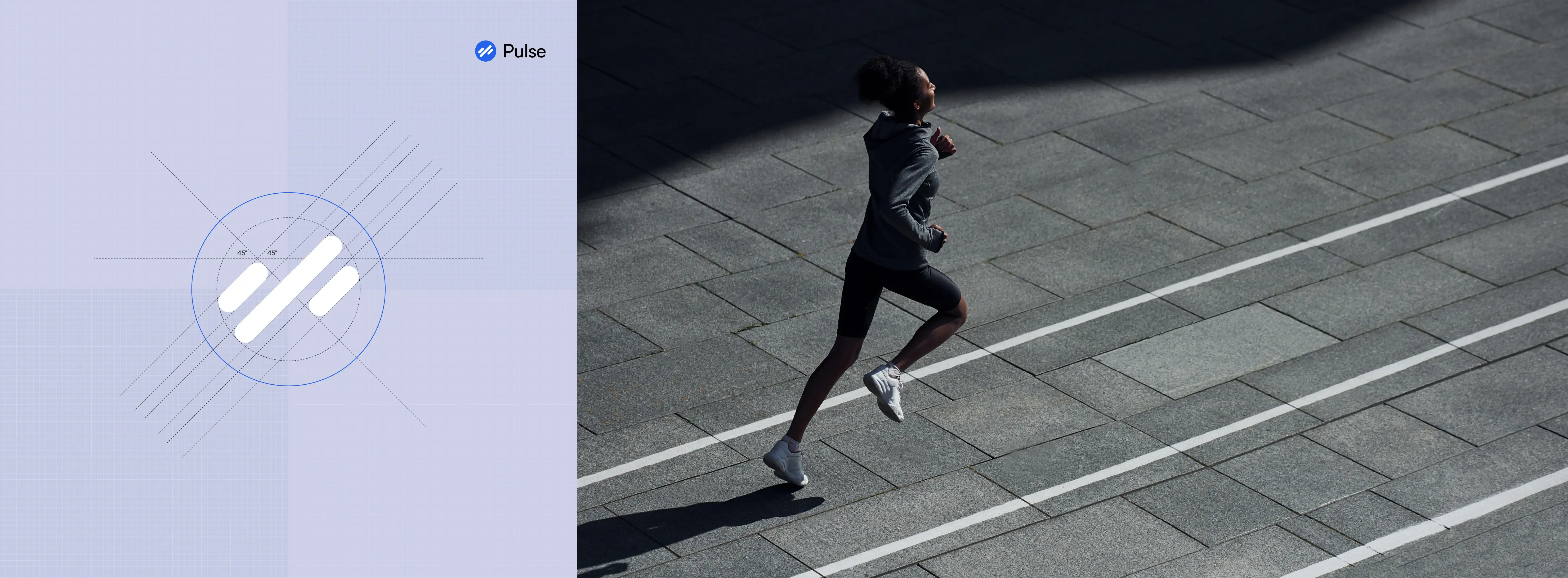
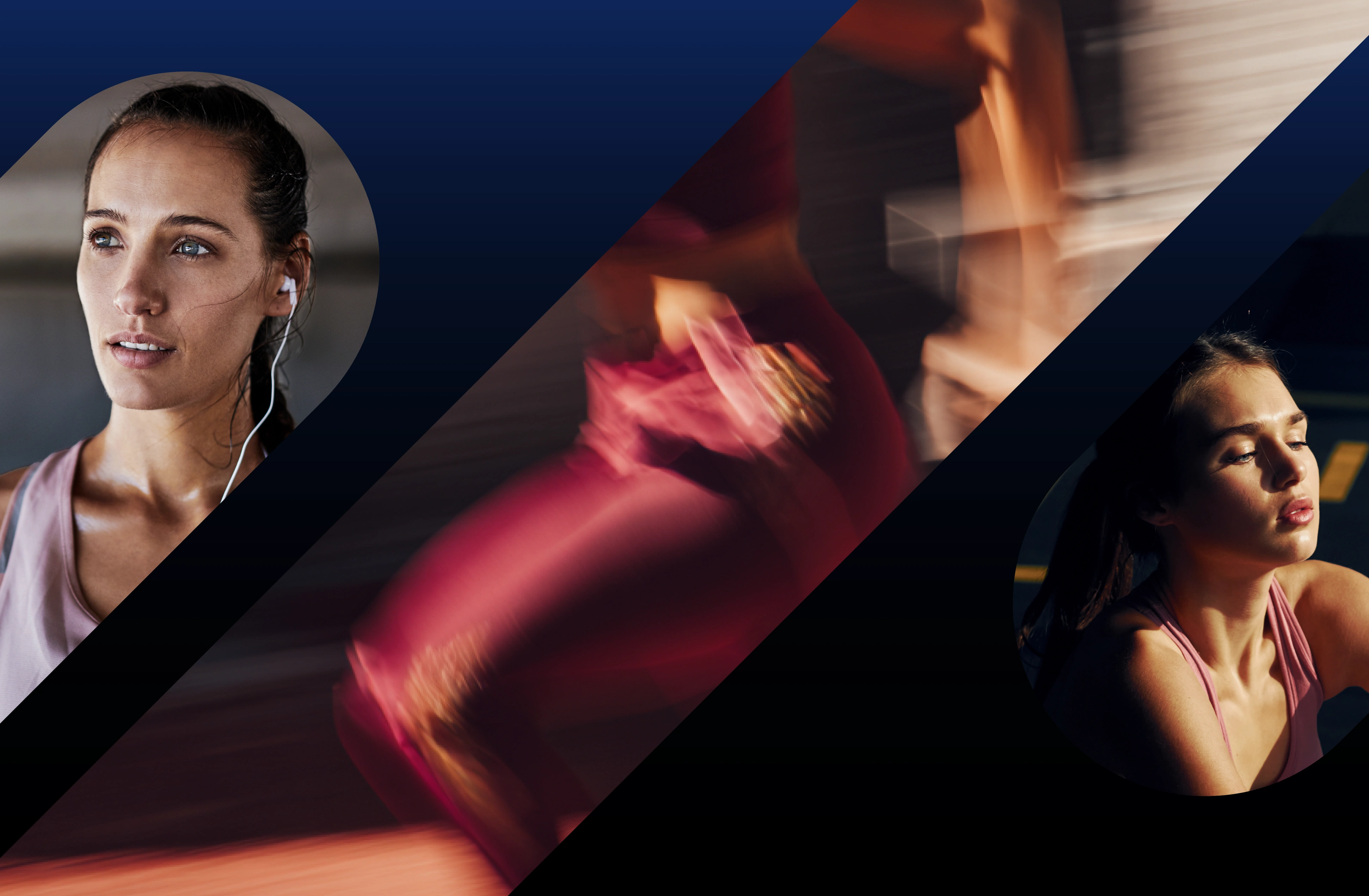
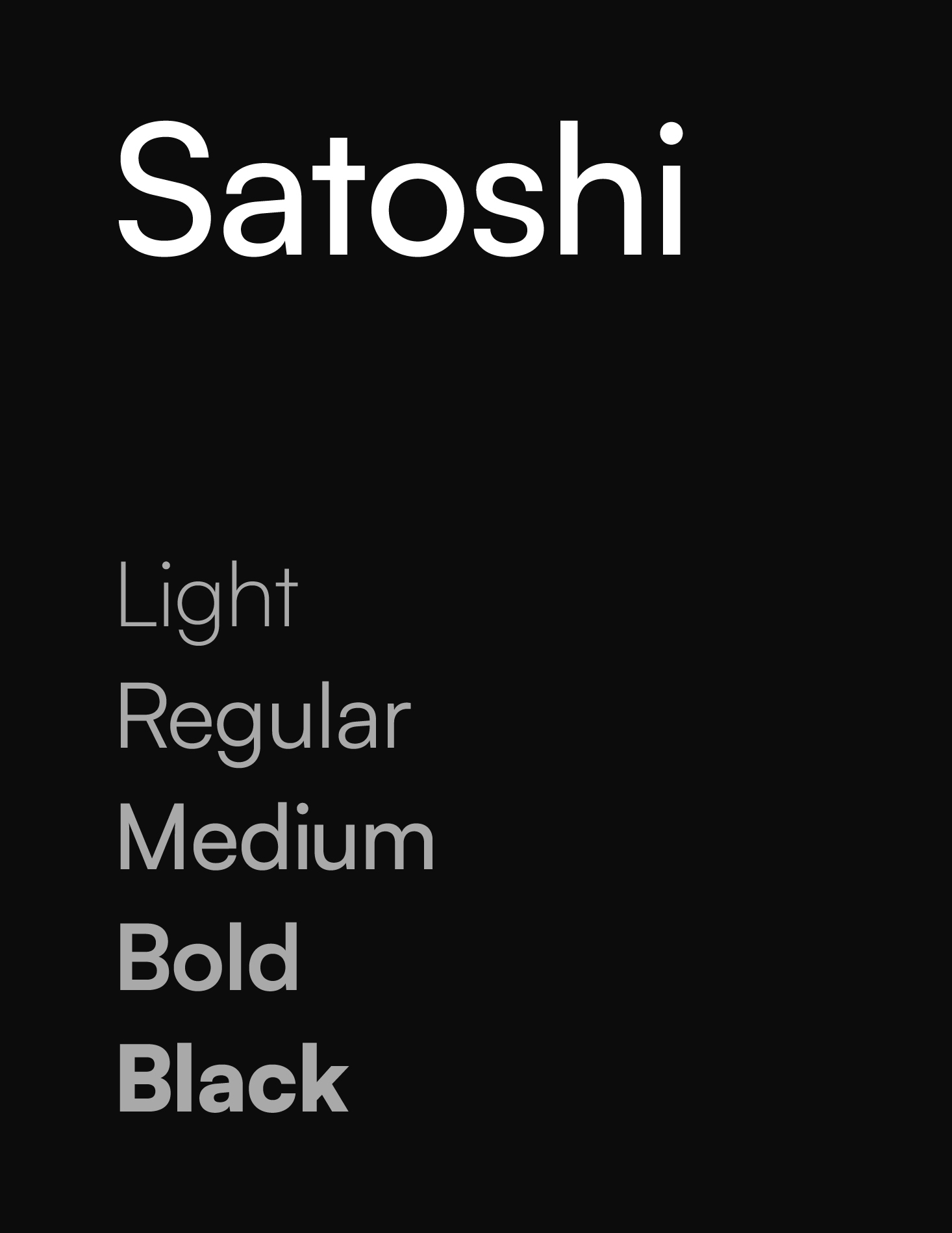
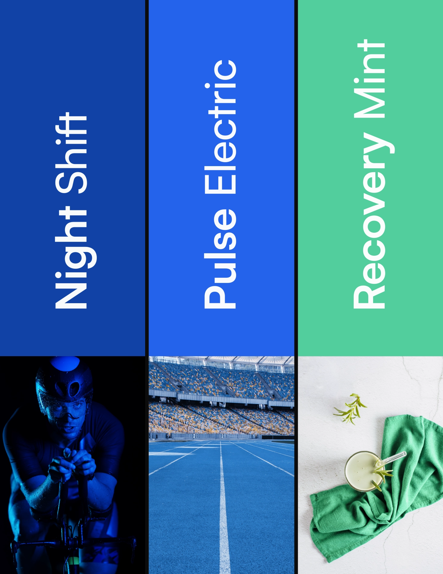
Pulse's compact diagonal mark extends into enlarged, cropped graphics across physical applications and campaigns. Satoshi provides a clear typographic foundation, from bold messaging to functional interface text. Deep navy anchors the system, electric blue brings intensity, and mint offers a contrasting accent. Together, these elements accommodate both energetic movement and quieter moments of reset.
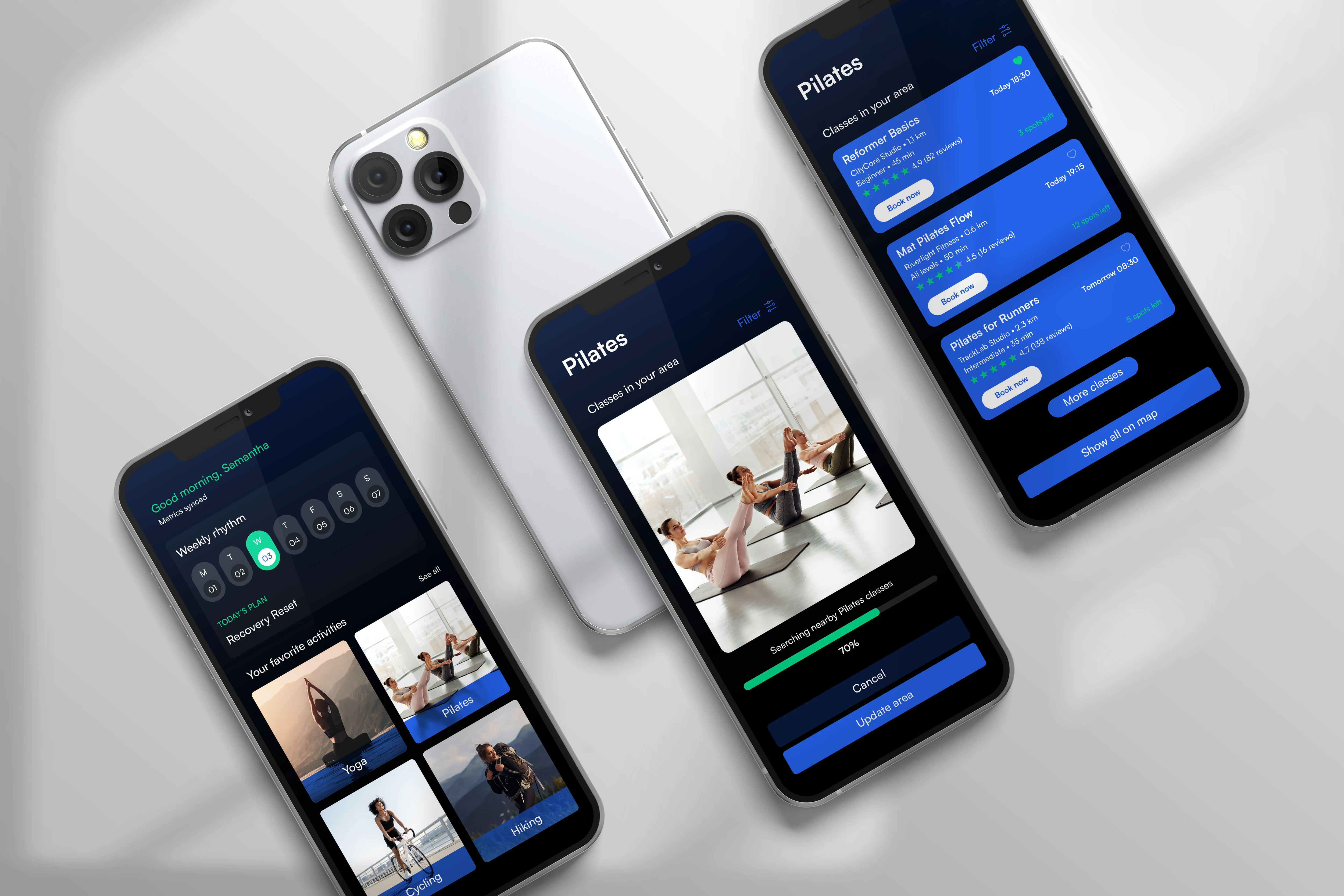
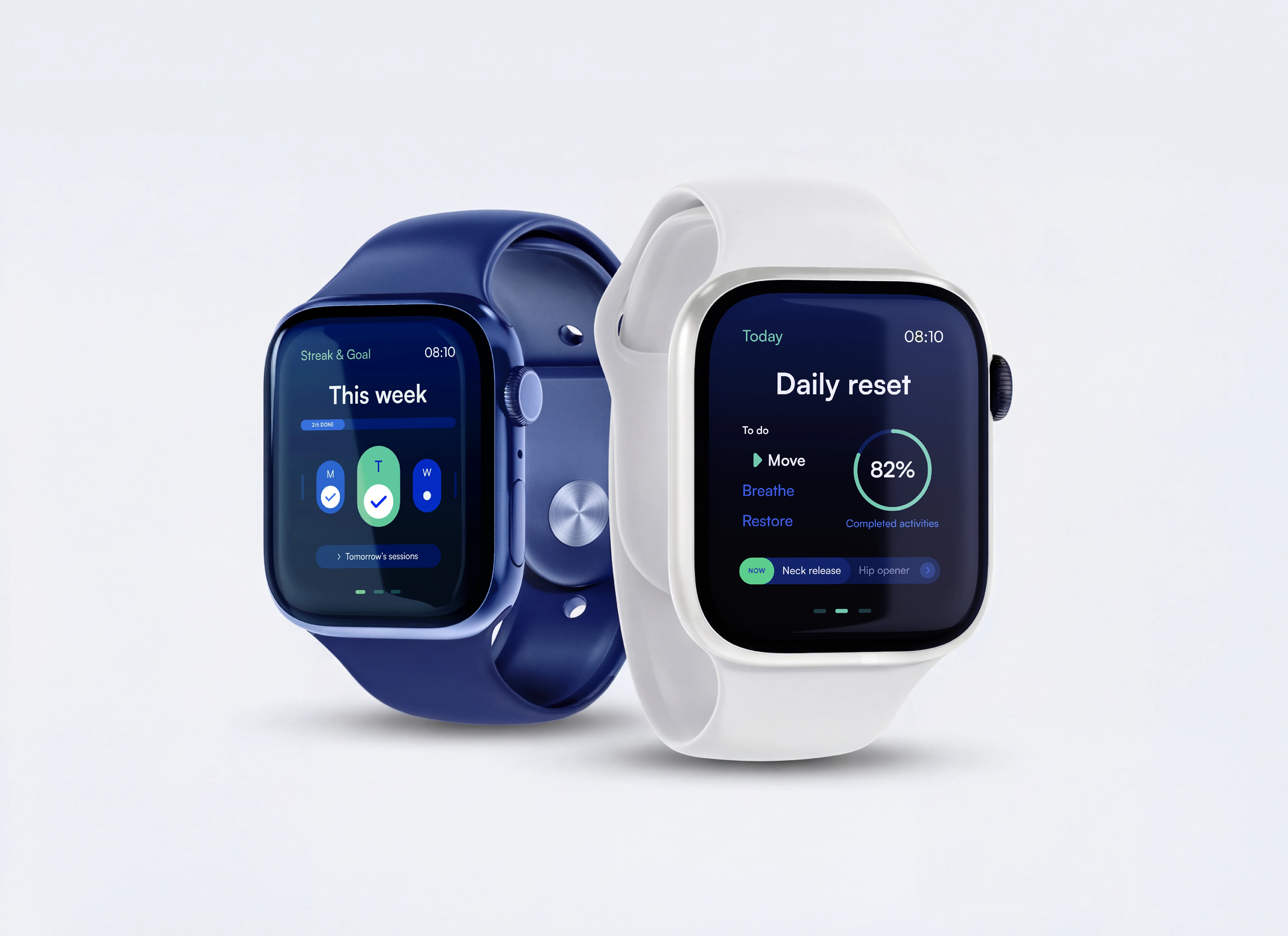
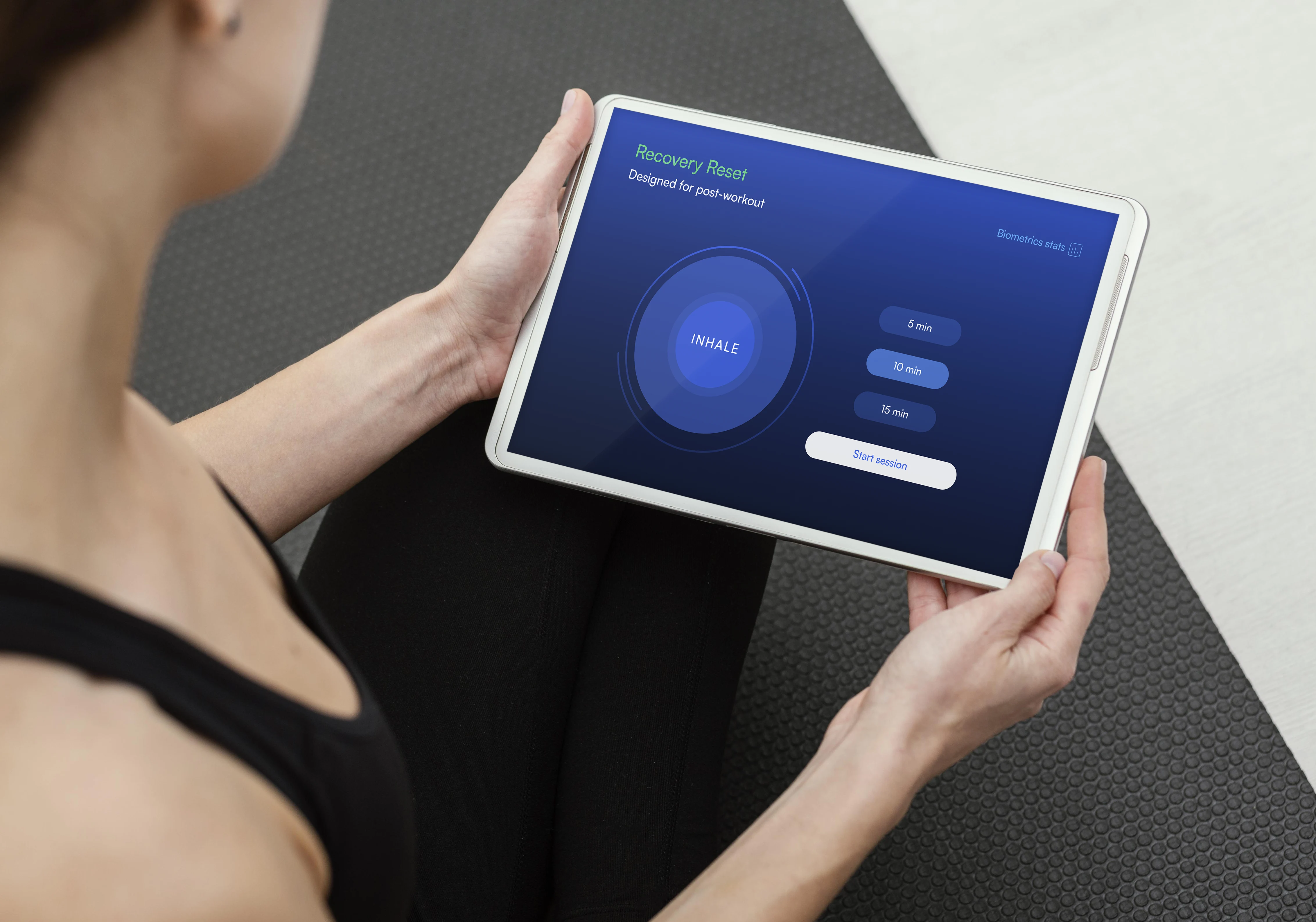
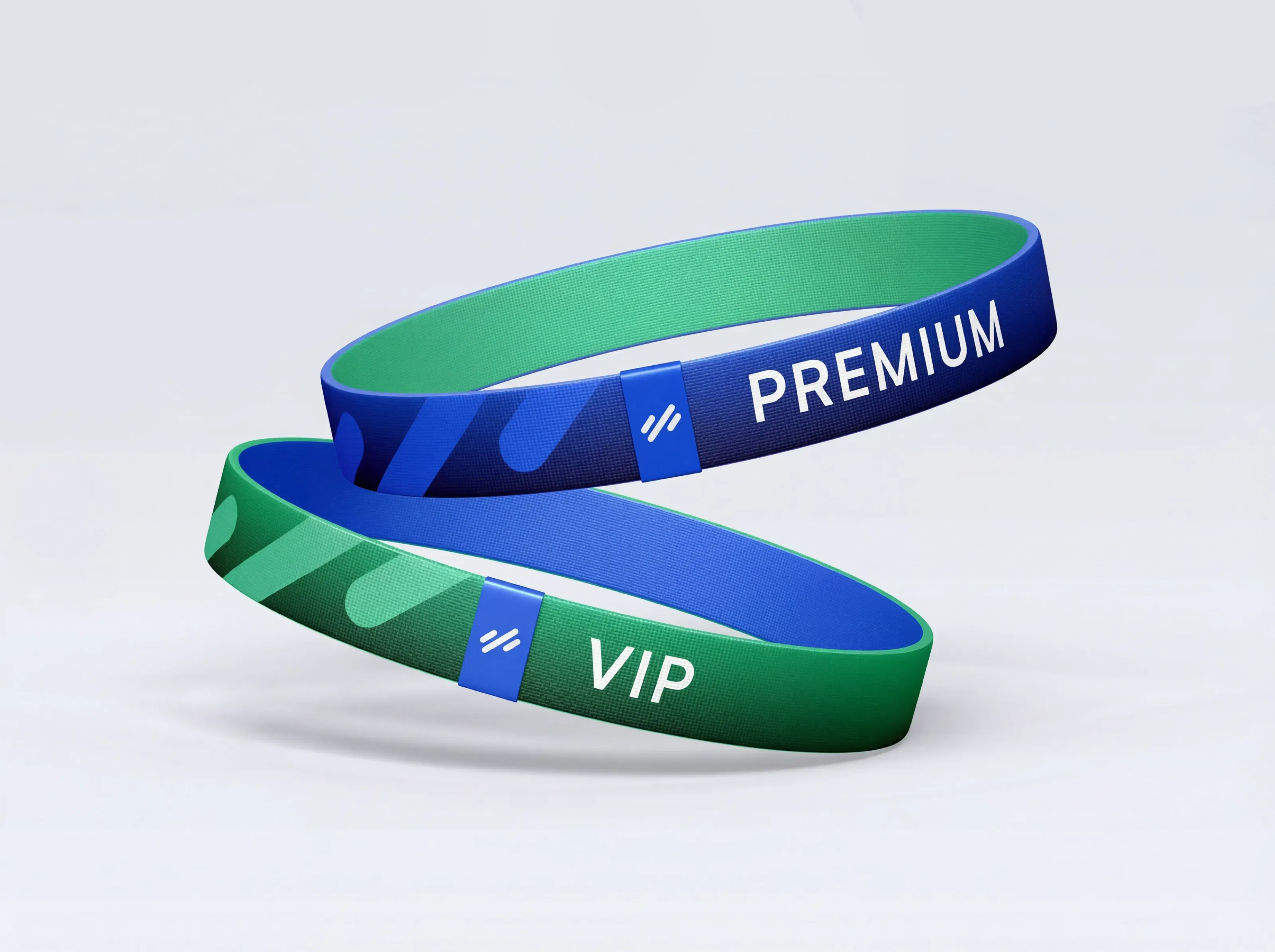
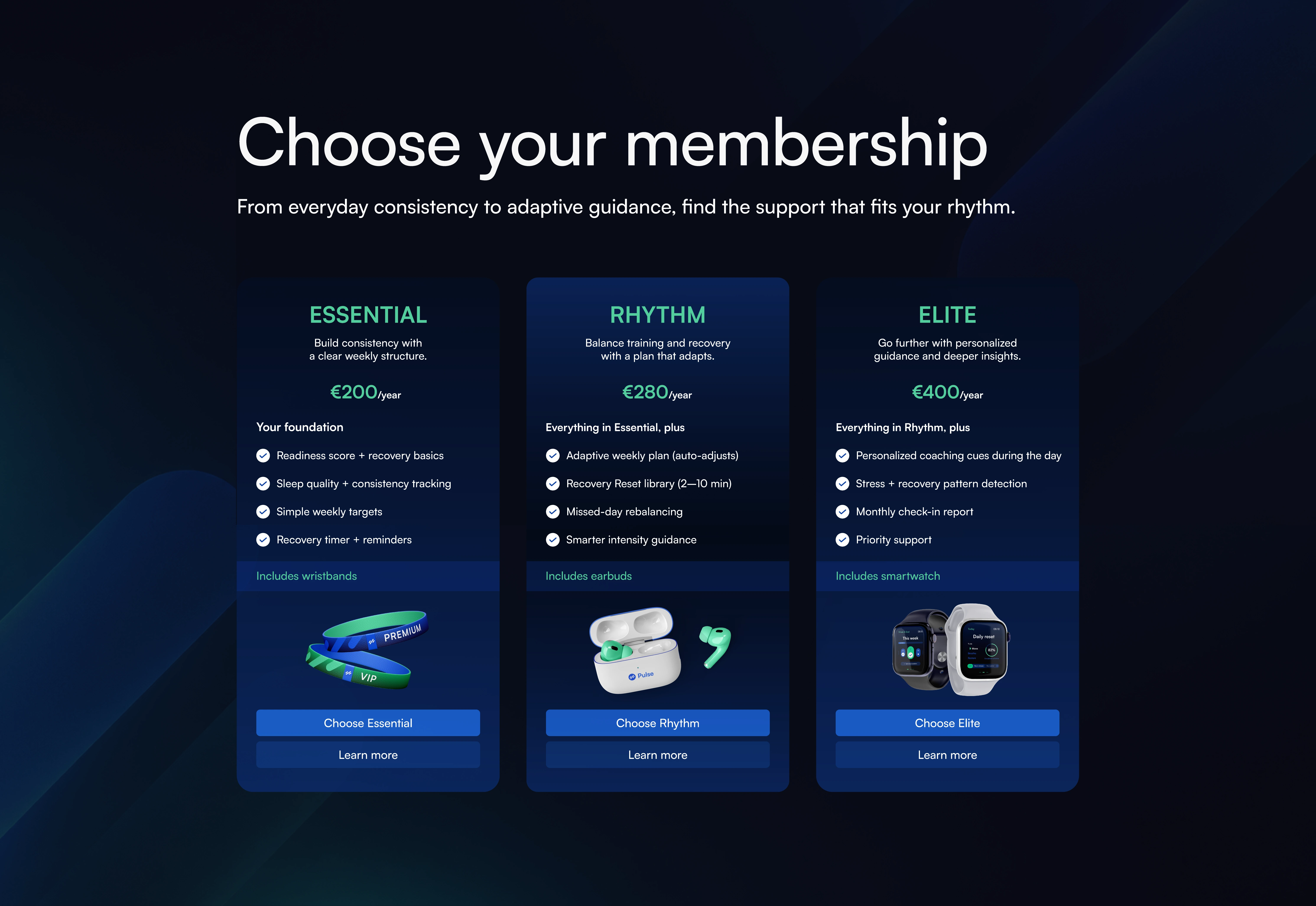
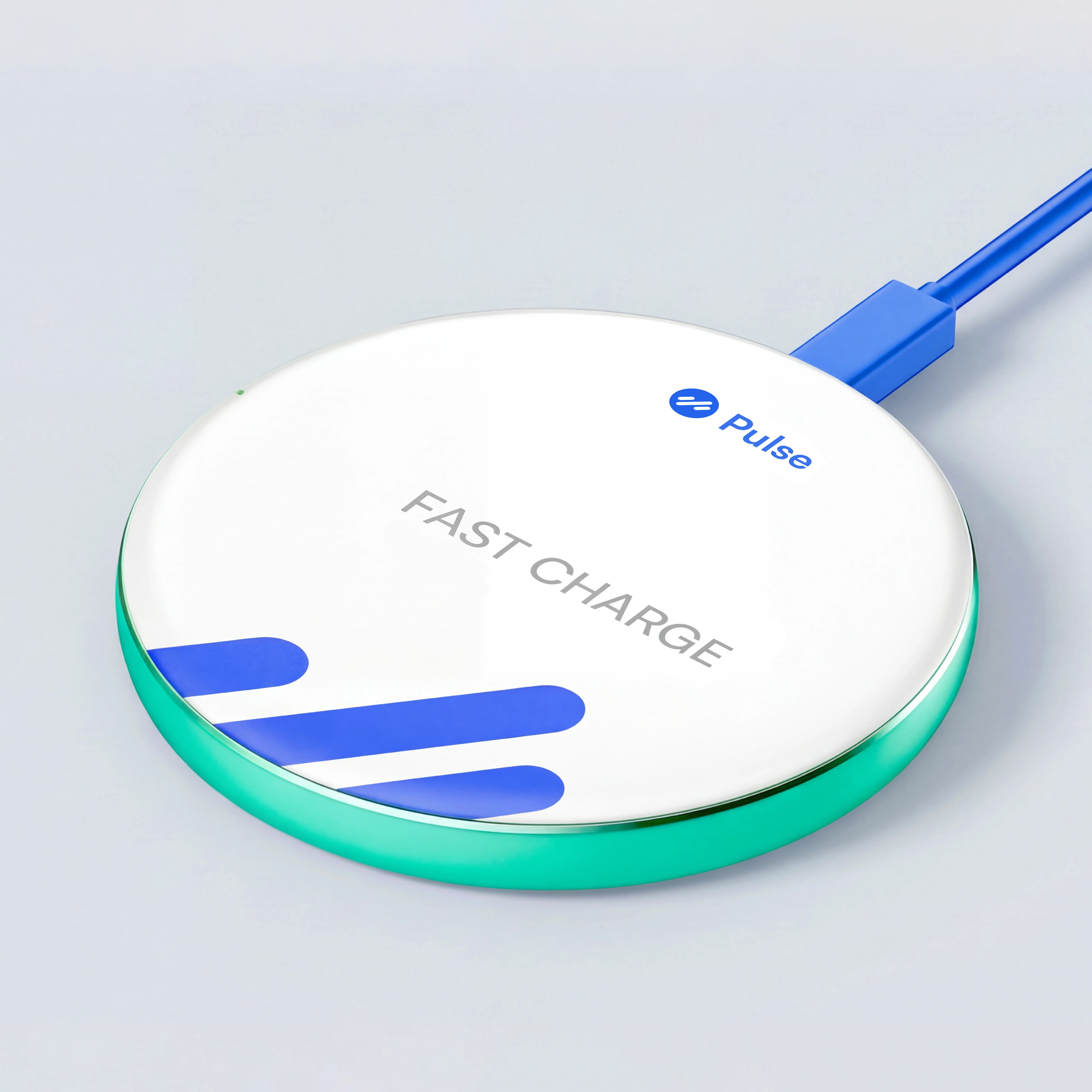
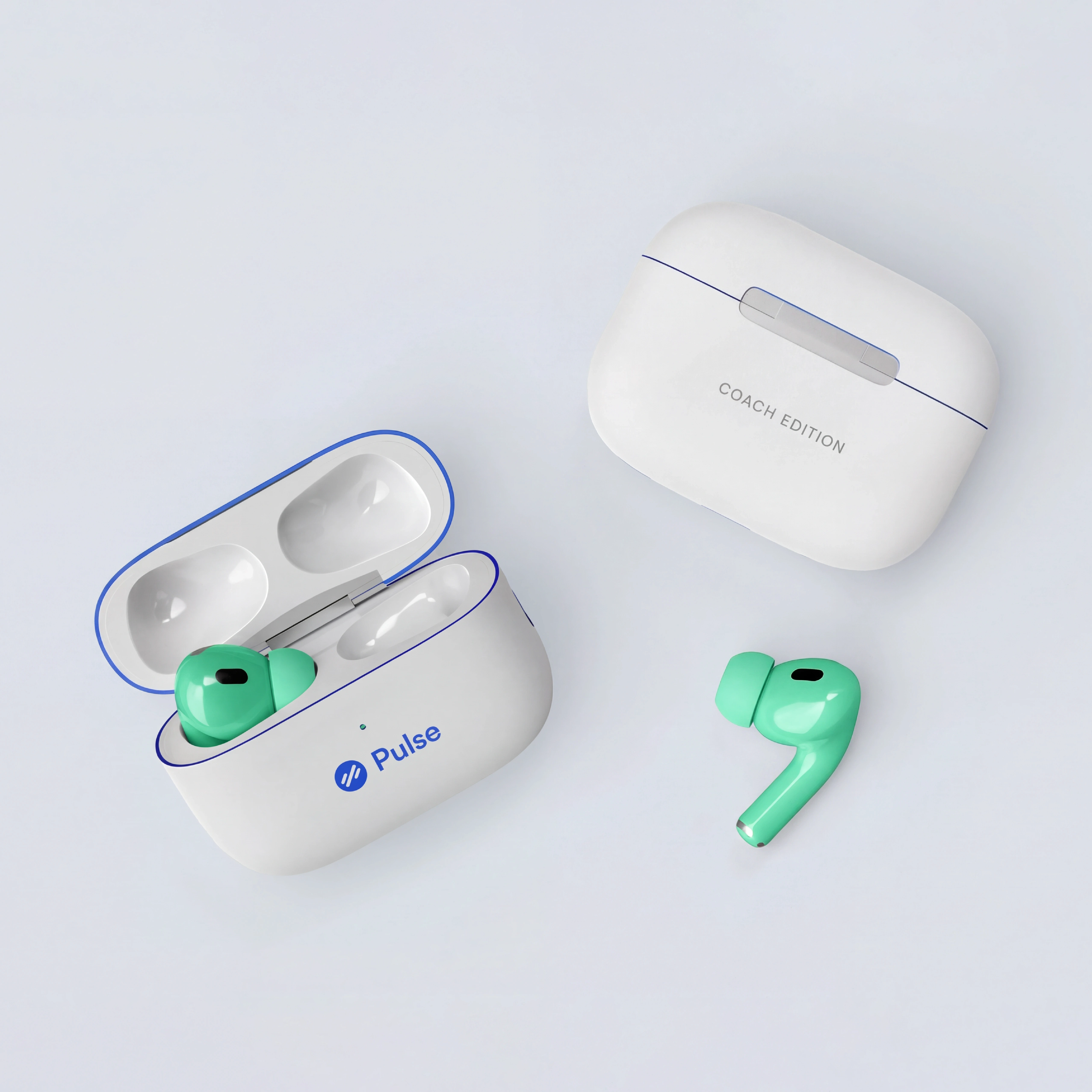
The challenge was to create one experience that could adapt across different touchpoints. A consistent design framework established a common visual language across screens, balancing recognition and flexibility while ensuring each interaction felt natural to its environment.
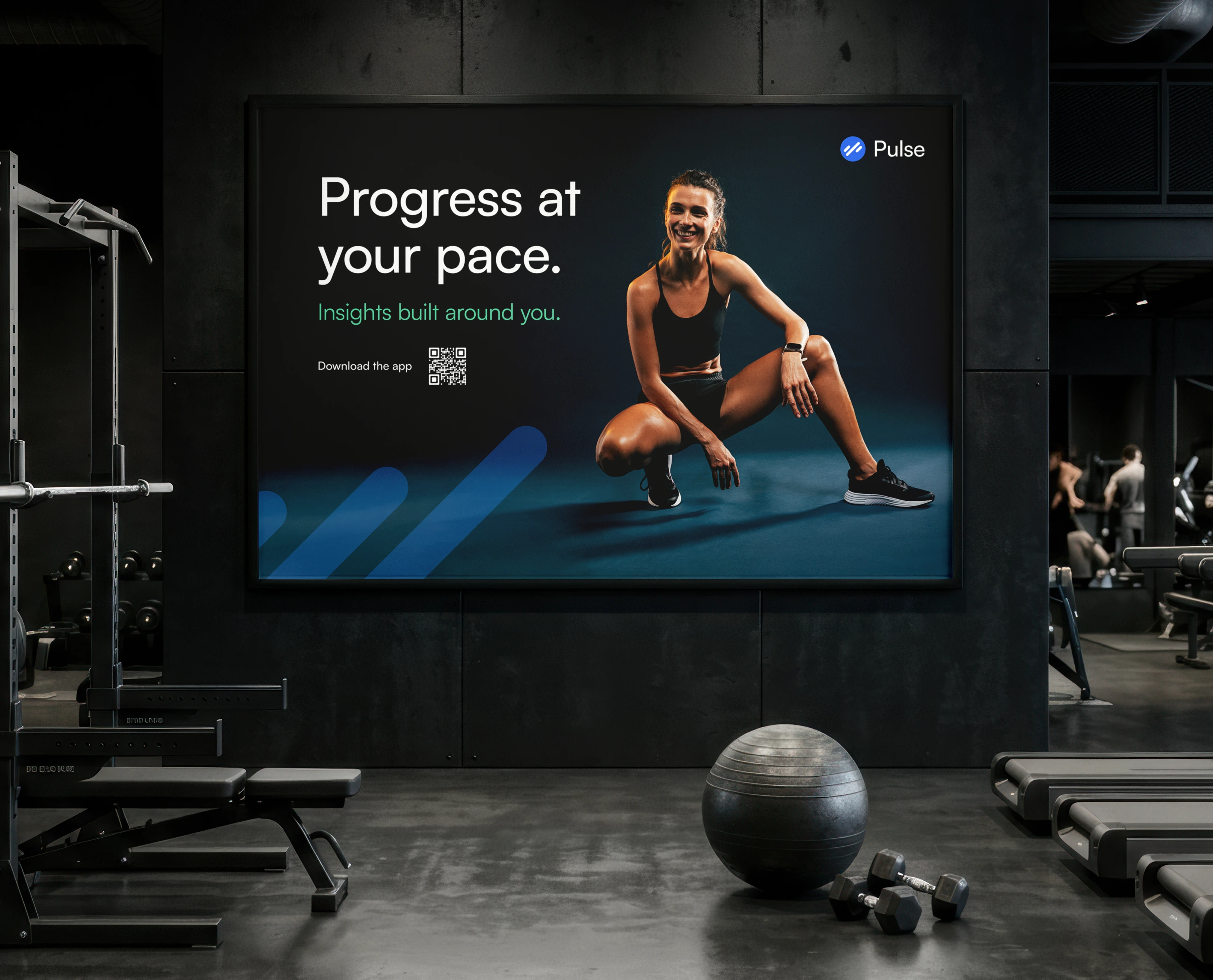
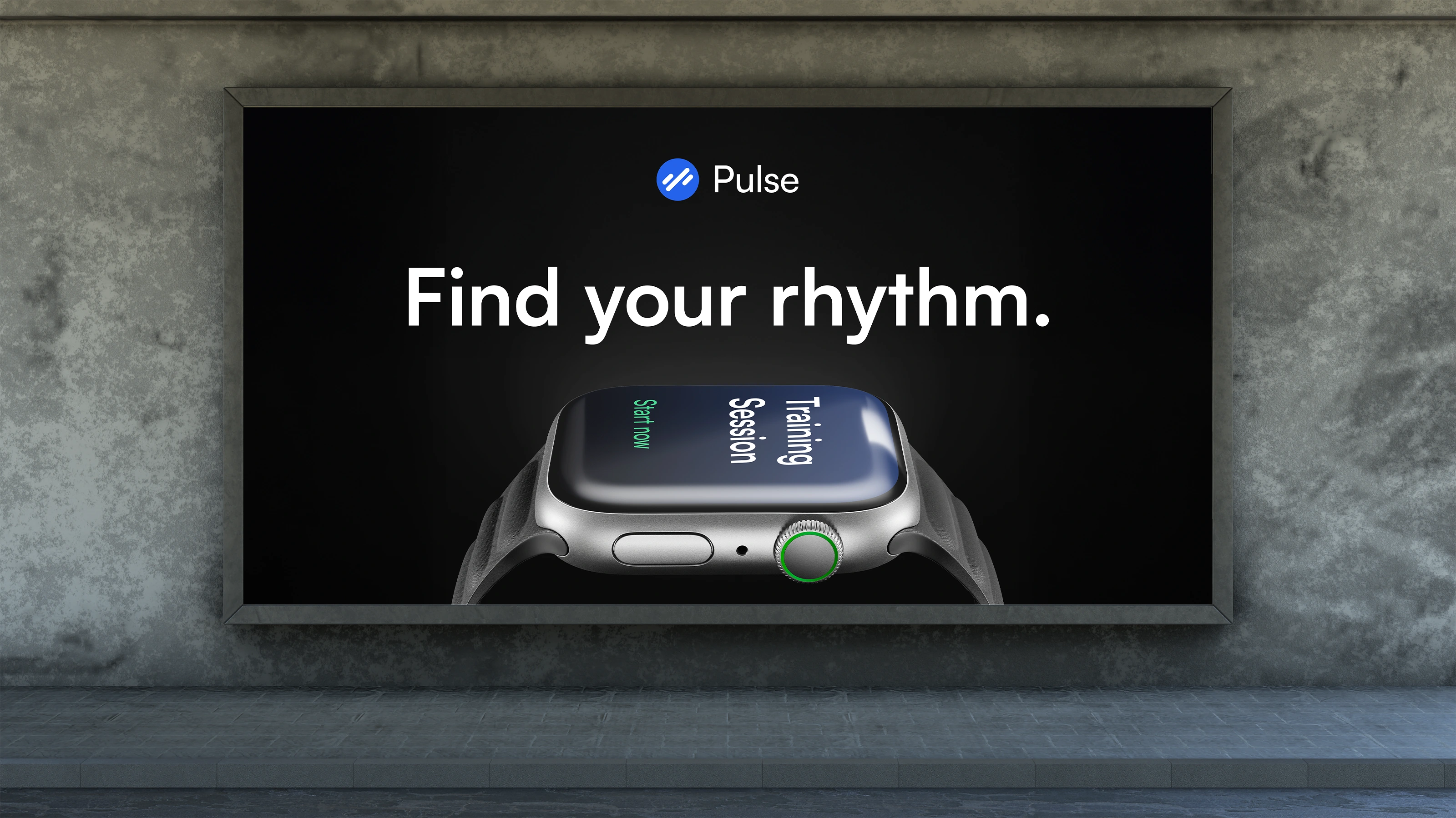
Most fitness brands sell intensity. Pulse was built around awareness. By connecting product, identity, and experience, I created a system that helps people understand themselves better and make progress with intention.
Let’s talk
Brand designer based in Bucharest, Romania, with 5 years of agency experience.